MyBank - Bank transfer dashboard - 2023
I have designed a desktop screen for a bank transfer app, focusing on providing a sense of security and reassurance for users.
The chosen persona is Bonnie, a 37-38-year-old UK based woman with children and a small yet successful business. I aimed to present all necessary information in a clear and intuitive way for a seamless user experience.

Name: Bonnie Dowdall
Age: 37
Occupation: Owner and Creative Director of “The Pinky Bow”, a boutique store
and online shop specializing in bridesmaid dresses and accessories.
Mother to: Alfie (4), and Max (2) Dowdall
Monthly income: £12,000
Hobby: Flower Arrangement
Design Aesthetic and Layout
I opted for gentle and clean colors, namely #1FABA9, #199A97, #3A454F, #23272E, #DBDFE3, and #CBD1D6.
Drawing inspiration from user-friendly and aesthetically pleasing websites such as n26.com, bankhapoalim.co.il, and wise.com.
The resultant design features a structured layout consisting of a dashboard with a clear and accessible sidebar, a distinct header, and a focused main area.
Desined features
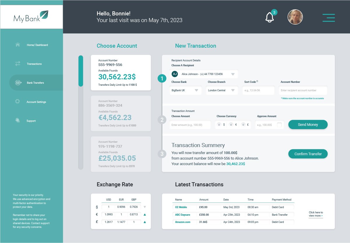
The sidebar -
Navigation links: Direct access to various sections including 'Home/Dashboard', 'Transactions', 'Bank Transfers' (highlighted to indicate the current page), 'Account Settings', and 'Support'.
Security disclaimer: Positioned at the bottom, this reinforces trust and encourages secure user behavior.
The header -
Logo: Designed with a symbol that encapsulates the sentiments of growth and success.
Personalized welcome message: Creates a more tailored user experience.
Alerts: Ensures that users are always updated with real-time notifications.
User profile picture: Enhances personalization and gives users a sense of ownership and security.
Hamburger menu: Allows users to easily navigate through other sections not immediately visible in the sidebar or header.
The main area (dashboard)-
Choose your account component: Allows users to select which account they wish to manage or view, displaying account details in three available currencies (USD, EUR, GBP).
Transaction process: This is outlined in three distinct steps, making the process intuitive and straightforward. A progress bar complements these steps, providing users with a visual indication of where they are in the transaction process.
Dashboard user flow
Step 1: "Recipient Account Details" - This step includes recipient selection, bank and branch choice, sort code, and account number input. An information icon provides additional details about sort codes.
Step 2: "Transaction Amount" - Users select the amount, currency, approve the amount via a checkbox, and click a "Send Money" CTA.
Step 3: "Transaction Summary" - Displays a summary of the transaction, including the amount, account numbers, and remaining balance, with a "Confirm Transfer" CTA.
Below the fold, there are two additional components: an "Exchange Rate" table for USD, EUR, and GBP, and a "Latest Transactions" list for the chosen account.
Color pallet

Final design
Conclusion
In this design project, the objective was to devise a functional, user-friendly, and aesthetically balanced interface for a bank transfer app.
Specialized in addressing the nuanced needs of users like our persona, Bonnie Dowdall, a 37-year-old business owner and mother.
The persona method in UX design was pivotal in this project, allowing for a more nuanced, empathetic, and user-centric approach in creating the design.
Developing a persona, like Bonnie, provides insight into user needs, behaviors, expectations, and motivations, allowing designers to create more targeted, user-friendly solutions that resonate with the end-users.
This method facilitated a deeper connection with the target demographic, refining the design process to address real-world needs and preferences more accurately.
The chosen color palette was both gentle and clean, intending to evoke feelings of security and calm, crucial in applications dealing with financial transactions.
Websites like n26.com, bankhapoalim.co.il, and wise.com were studied for inspiration to ensure the design is cohesive, modern, and user-friendly.
The layout consisting of a dashboard, sidebar, header, and main area, was strategically organized to present essential information clearly and intuitively, enhancing user navigation and interaction.
The design was tailored to reflect Bonnie's lifestyle, preferences, and daily activities, emphasizing simplicity, efficiency, and elegance to appeal to users juggling between professional and personal responsibilities.
Every design element was optimized to reduce cognitive load, ensuring a seamless and enjoyable user experience for a diverse user base.
This project served as a practical exploration into integrating user-centric and empathetic design principles to develop solutions that are aligned with user needs and preferences.
It emphasized the significance of informed and thoughtful design in contributing to user-friendly and inclusive digital experiences.
By employing a thoughtful and user-focused approach, this design aspires to be more than just visually appealing and user-friendly.
It seeks to align deeply with the needs and preferences of the users, aiming to add substantial value and elevate the overall user experience in the realm of digital banking.
This holistic approach, informed by the persona method, exemplifies the transformative power of user-centered design in creating meaningful, impactful, and resonant solutions in the evolving landscape of digital services.
Next case >